P50, P95 and P99: percentiles and the latency your average hides
Understand P50, P90, P95 and P99, find the slowness your average hides, and learn to measure latency, aggregate histograms and set targets for your API.
performance
observability
system design
latency
sre

Ednaldo Luiz
Level: Intermediate
Level:
Published:
Last updated:
15 min read
views: - views
Introduction
Support tells you that finishing a purchase is taking too long. You open the checkout dashboard: average response time close to 120 ms.
Looks fast. So why are people waiting seconds?
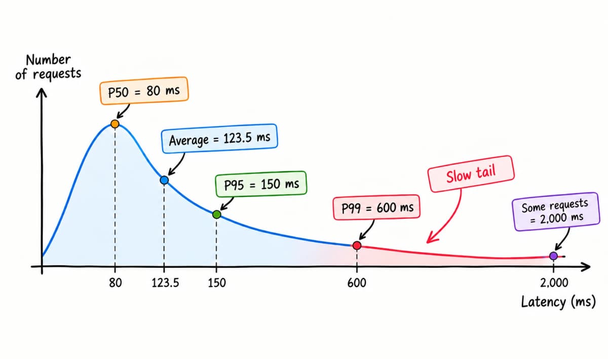
Both things can be true. Most requests finish quickly, while a share of them hits a much slower path.
Part of that difference is not in the infrastructure, it is in the data. The same endpoint does more work for the customer who has ten times more orders. The request is the same; the volume it goes through is not.
Summarizing everything into one average pushes that difference out of view.
Percentiles of latency exist to show that distribution, and P50, P95 and P99 are the usual ones. They separate the most common experience from the tail: the requests that take longest.
But swapping the average for a P99 dashboard does not close the problem. We also need to know what was measured, how the data was aggregated, and what that number lets us conclude.
TL;DR
P50 shows the median; P95 and P99 help you watch the latency tail. They describe positions in the distribution, not percentages of improvement and not the worst case.
To use them well, compare the same population and window, aggregate the distributions before computing percentiles, and read the results alongside volume and errors.
What P50, P90, P95 and P99 mean
The P stands for percentile, and percentiles point at positions in a sorted set of values. For latency, we sort the response times from fastest to slowest.
P95 of 250 ms means, in the operational reading, that roughly 95% of the observations landed at or under 250 ms. P50 is the .
| Percentile | Position observed | What it helps you see |
|---|---|---|
| P50 | Half of the distribution | The center of the response times |
| P90 | Up to 90% of the observations | A band slower than the median |
| P95 | Up to 95% of the observations | The experience near the final 5% |
| P99 | Up to 99% of the observations | The experience near the final 1% |
Both readings describe the same line. Up to 99% names who was covered by the value; the final 1% names who landed above it, and that is where the pain is.
The number after the P sets the position. The value attached to it stays in the unit you measured: milliseconds, seconds, or another unit of duration.
So P99 = 600 ms does not mean "99% faster". These are two numbers with different jobs: 99 is the question, the point of the distribution you chose to look at; 600 ms is the answer the data gave.
Another distinction: a percentile of requests is not a percentile of users. One person can make several calls and show up many times in the sample. You cannot conclude that "only 1% of customers suffered" because 1% of the requests landed above a threshold.
To get past the definition, let us compute these points on a fictional checkout.
Average and percentiles in practice
An average of 123.5 ms can live side by side with two-second requests. The example below shows exactly how.
Consider 1,000 successful requests to the same endpoint, measured at the API edge over five minutes. The times are synthetic and grouped to keep the arithmetic easy:
| Requests | Position in the sorted sample | Latency of each one |
|---|---|---|
| 900 | 1 to 900 | 80 ms |
| 50 | 901 to 950 | 150 ms |
| 40 | 951 to 990 | 600 ms |
| 10 | 991 to 1,000 | 2,000 ms |
The average comes from adding up every duration and dividing by how many there were:
Sum of durations
Requests
Average
123,500 ms
1,000
123.5 ms
Sum of durations
123,500 ms
÷
Requests
1,000
=
Average
123.5 ms
The arithmetic is right. But no request in that sample took 123.5 ms. The average condensed four different experiences, from 80 ms to two seconds, into a single number.
To compute the percentiles we will use a simple convention called nearest rank: multiply the fraction you want by the sample size, round up, and find that position in the sorted list. It is not the only method; some tools interpolate between observations.
For P95, the position is 0.95 × 1,000 = 950. The request at position 950 took 150 ms. Repeating the calculation gives us P50 = 80 ms, P90 = 80 ms, P95 = 150 ms and P99 = 600 ms.
Here is where P50, P95 and P99 land in the sorted sample:
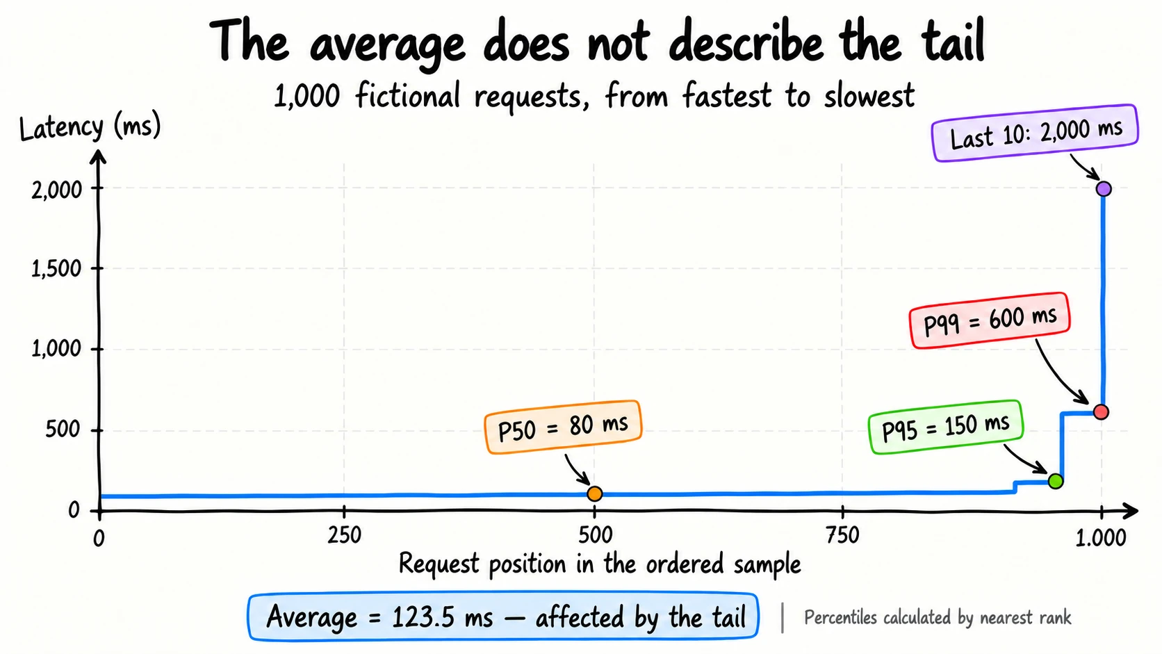
The horizontal axis represents positions, not the passing of time. After P99 there are still ten requests, all of them at two seconds.
P90 is not on the chart because it would land on the same point as P50. Of the thousand requests, 900 took 80 ms, so position 500 and position 900 point at the same number. Do not expect four percentiles to return four different values: where there are ties, they coincide, and that is normal.
The chart also shows an important limitation: P99 is not the maximum. If those last ten requests went from two seconds to ten, P99 would stay at 600 ms under this method. The average would go up.
That does not make percentiles bad or the average useless. They answer different questions. The average summarizes time per operation; percentiles show how far into the distribution we have to walk to cover a given share of the observations.
And what about P99.9? It sits at position 999 of a thousand, which took two seconds. But 0.1% of a thousand is one request, and one request is not a pattern. More decimal places after the P do not invent data nobody collected.
So far the tail has been a detail of one sample: ten requests out of a thousand. In a distributed system it stops being a detail.
Tail latency
Tail latency is the slowness at the far end of the distribution. In distributed systems it matters because a single response can depend on many chances to run into a slow call. This is the problem Jeffrey Dean and the Brazilian Luiz André Barroso described in The Tail at Scale, in the Communications of the ACM in 2013, and the calculation coming up in a moment is theirs.
A fast request may find the data in cache. Another has to query the database, wait for a connection from the pool, or contend for a lock. The same query can even skip the index for one customer alone, because that customer filled in a field the others leave empty.
Runtime pauses, queues and external dependencies can also stretch only part of the calls. The percentile shows the effect, not which of those mechanisms caused it.
The shape of that tail is a property of the system, not of the metric. Two services in production, at peak hour, on the same dashboard:
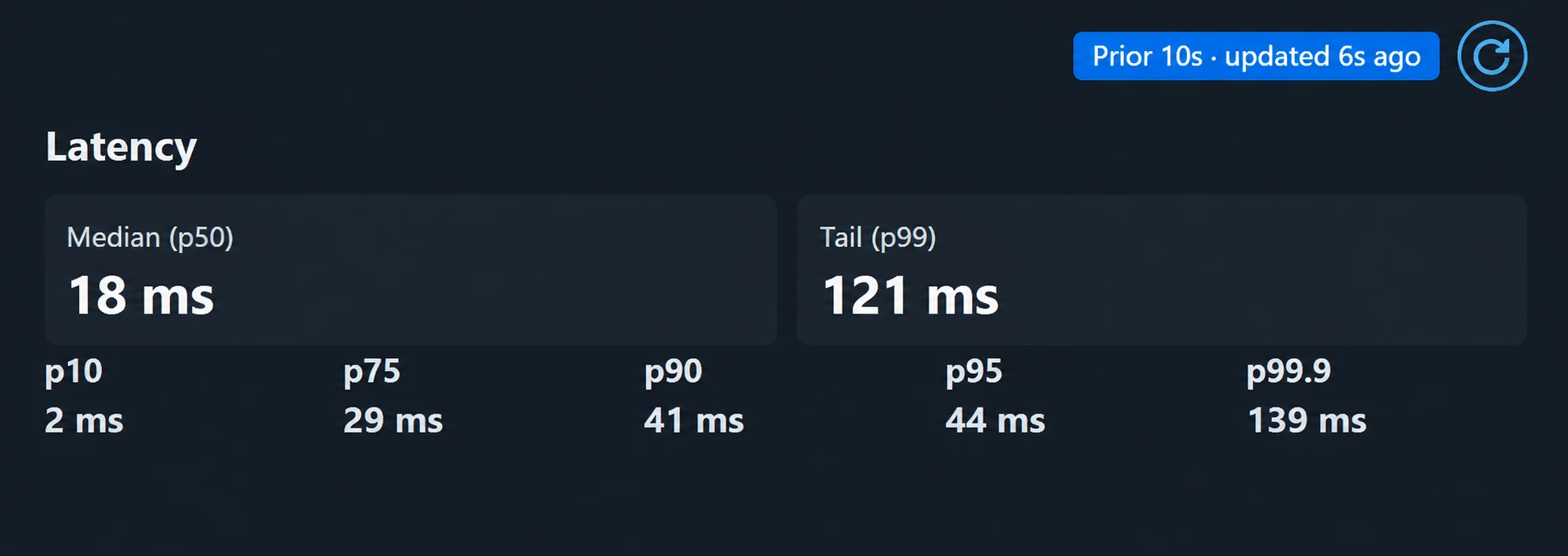
From p10 to p90 the latency moves slowly, and p90 and p95 almost touch: 41 and 44 ms. Between p95 and p99 it nearly triples. The jump is not spread out, it sits in the last 4% of the requests. Service not identified; the values are the ones on the dashboard at the moment of the screenshot.
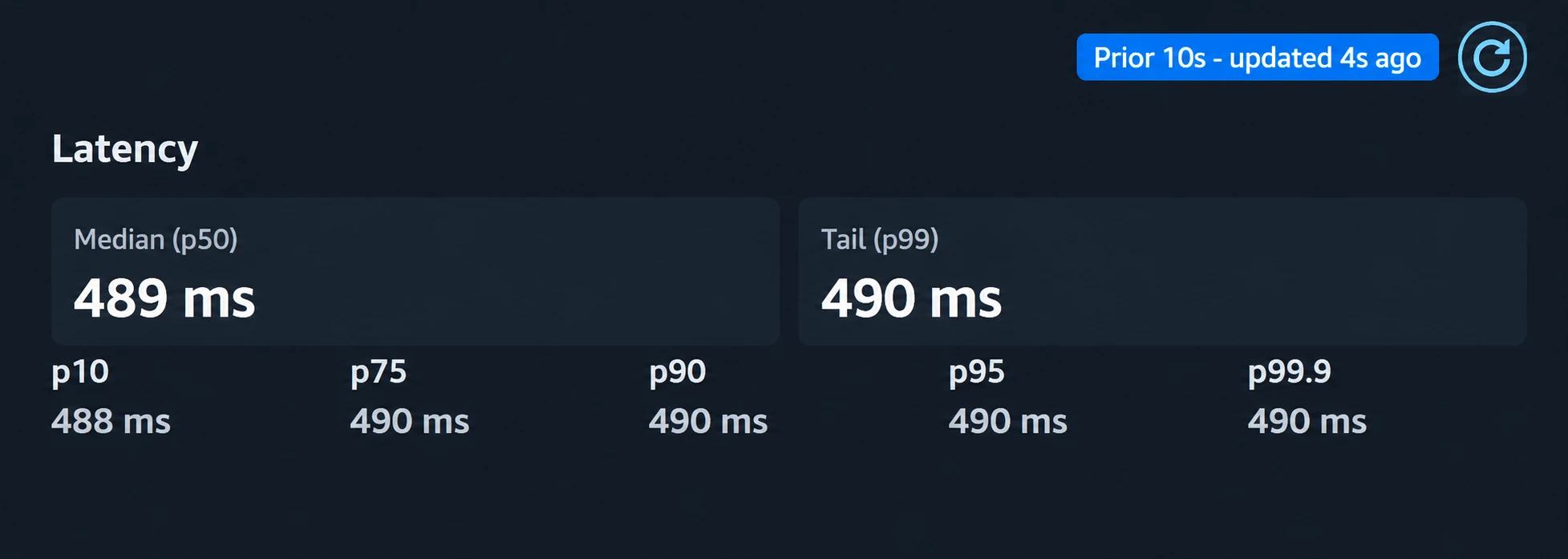
From p10 to p99.9, two milliseconds of difference. There is no tail here for the average to hide, and a chart of this would be a straight line.
Neither one is wrong. They are different systems, and that is why what is a good P99? has no answer outside your own dashboard.
Now picture a screen that queries several dependencies in parallel and only finishes when all of them answer. Going parallel avoids adding the waits one by one, but it does not remove the longest one: the screen takes as long as the slowest call, plus the work of assembling the responses.
This is Dean and Barroso's example: a server with a P99 of one second leaves one call in every hundred slow. The math is easier backwards, by computing the chance that everything goes well and taking it off the total:
1
One call comes back fast
0.99If it lands in the slow range 1% of the time, it comes back fast the other 99%.
2
All the calls come back fast
0.99 × 0.99 × … = 0.99ⁿWe multiply because all of them have to work out at the same time, and the exponent is how many calls the response needs. The math assumes one does not influence another.
3
At least one comes back slow
1 − 0.99ⁿEverything that is left. It is cheaper to compute the good case and take it off 1 than to add up the combinations one by one.
4
Now with a hundred calls
n = 100 → 0.99ⁿ = 0.366 → 1 − 0.366 = 0.634All hundred coming back fast happens 36.6% of the time, a little over a third. Everything else is a slow screen: 63.4%.
The chart shows how that probability grows:
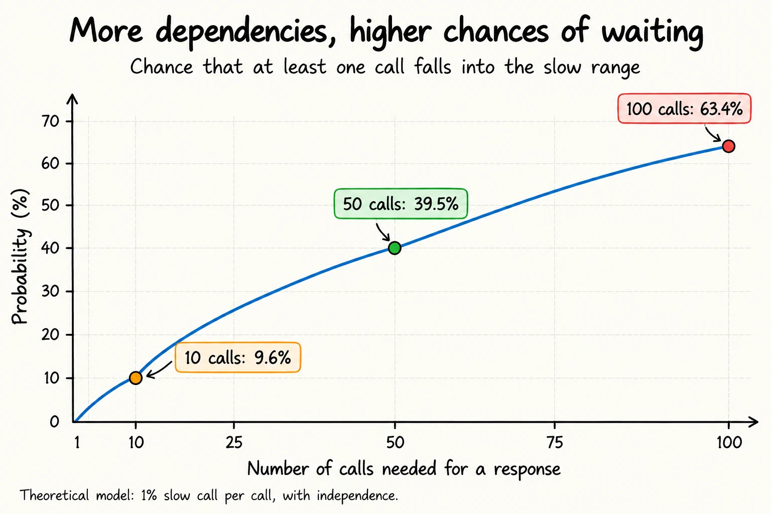
The calculation assumes independent calls, all of them required, with the same chance of being slow. Shared dependencies and correlated failures change these values.
The exception on each call became the common case for the screen. Nothing changed on the server: what changed was how many chances the response had to run into the tail.
And you cannot add up the P99s of the services and call the result the P99 of the journey. The slow events can happen on different requests or coincide. Measure the complete operation, on top of the internal calls.
The design question becomes concrete: does the response really have to wait for all of those dependencies? Can an optional block sit outside the critical path? The answer depends on the product, not only on the technical ability to fire calls in parallel.
But any decision like that depends on trusting the number on the dashboard. And producing a misleading P99 is easier than it looks.
How to measure percentiles without distorting the result
A P99 needs to come with context: which operations, in which window, measured from where, and with how many observations? Without that, two dashboards can show different numbers and both be correct.
Before the caveats, one idea that organizes all of them. Average, percentile and histogram are not three subjects: they are three summaries of the same pile of durations, and what separates them is what each one throws away.
| Summary | What it keeps | What it throws away |
|---|---|---|
| Average | the sum and the count | everything else |
| Percentile | one point of the sorted line | the whole distribution |
| Histogram | how many fell in each range | where each one fell in the range |
The average is not on every dashboard by accident: it is the cheapest of the three. The service only has to keep two numbers in memory, an accumulator and a counter, and it never stores a single duration. Going down the table costs more memory and returns more information, and that trade decides what your number can answer.
Preserve the distribution before computing
In telemetry, a histogram records how many observations fell into ranges of values, called buckets. That way we do not have to keep every individual duration to retain information about the distribution. The OpenTelemetry metrics model offers Histogram and ExponentialHistogram for exactly that.
This representation has a price: the percentile may be an estimate. If a range covers 250 ms to one second, we know how many observations landed there, but not their exact positions inside it. The resolution you choose limits the precision.
That explains why one tool can show 487 ms and another 493 ms without a bug necessarily being involved. Different methods and resolutions can produce different estimates; decimal places do not guarantee exactness.
There is a case where this stops being imprecision and becomes blindness: when the service is too fast for the ruler. Default buckets usually start in the millisecond range, a thousand times above the scale of a service that answers in microseconds, and then it dumps everything into the first bucket. P99 stops moving and starts to look healthy precisely because it cannot see anything anymore. That band is what ExponentialHistogram is for, since it adapts the resolution to the scale of the data instead of requiring you to get the ranges right before you measure.
The average of P99s is not the global P99
Suppose two checkout instances in the same window. The first serves 10,000 requests, all at 100 ms. The second serves 100, all at two seconds. Each one reports its own P99, and the question is which number represents the checkout.
1
The P99 of each instance
100 ms and 2,000 msInside each sample every request took the same time, so the percentile is the value itself: 100 ms on the first, 2,000 ms on the second. These are the two numbers that reach the dashboard.
2
The average of the two P99s
(100 ms + 2,000 ms) ÷ 2 = 1,050 msAdding and dividing by two gives both instances the same weight. The one that answered 1% of the traffic comes in with half of the result, and the number that comes out never happened to any request.
3
The P99 of all 10,100 together
0.99 × 10,100 = position 9,999 → 100 msSorted, the 10,000 requests of 100 ms occupy positions 1 through 10,000, and 9,999 falls inside them. The real P99 is more than ten times smaller than the average of the two.
The distance between 1,050 ms and 100 ms is not rounding. The first number is the average of two summaries; the second is the same nearest rank from the earlier example, applied to the whole sample. A percentile keeps the position and throws away the distribution that produced it, and no arithmetic done afterwards recovers what was discarded, not even weighting by volume. The way out is to aggregate compatible histograms and compute the percentile afterwards.
With a classic histogram in Prometheus, an illustrative query would be:
checkout-p99.promql
histogram_quantile(
	0.99,
	sum by (le) (
		rate(http_request_duration_seconds_bucket{
			job="checkout",
			route="/checkout",
			method="POST"
		}[5m])
	)
)Here, sum by (le) combines the buckets from the instances before histogram_quantile estimates the P99. The result is in seconds: 0.6 represents 600 ms. The query assumes compatible buckets; names and labels are examples, not a universal configuration.
The same caution applies over time: the average of each minute's P99 does not represent the P99 of the day.
Check who made it into the measurement
Mixing a two-millisecond health check with an eight-second export produces a number that is hard to use for judging either experience. Separate operations with different expectations. Also distinguish the duration of an internal attempt from the complete operation, which may include retries.
The observation point matters. A duration recorded by the server does not necessarily cover the network time seen by whoever called it. The documentation, for one, draws exactly that distinction.
Three more caveats keep you from the wrong diagnosis:
- Few samples: with a hundred observations, P99.9 becomes the maximum under nearest rank. That is not the same as knowing the rare behavior of the service well.
- Fast failures: answering with an error can lower latency and make the product worse. Separate success from failure and track the duration of each.
- Selected traces: a sample concentrated on errors or slow calls does not automatically represent the distribution of all requests. Use it to investigate, not as a silent stand-in for the measured population.
The test can ease off exactly when the system gets worse
If the generator only sends the next request after the previous response, a slowdown reduces the rate of new arrivals. That effect can hide part of the problem and is known as coordinated omission.
When the goal is to simulate independent arrivals, use a load model that preserves that property. The closed model is not always wrong; it answers a different hypothesis about usage.
The documentation explains this difference between open and closed models. The test has to represent the demand you want to evaluate, not just produce a pretty percentile.
With the measurement in order, the percentile starts to serve more than observation: you can make a promise with it.
From P99 to SLO: turn latency into a target
SLO, or Service Level Objective, is a target for the quality of the service. To track whether it is being met, a ratio of good events over eligible events makes it easy to count what did and did not meet the expectation.
Instead of leaving just "P99 under 300 ms" in the document, we can make the promise explicit:
Over a rolling 28-day window, at least 99% of eligible checkout requests must finish successfully within 300 ms, measured at the API edge.
Eligibility has to be defined. In this example, internal errors and timeouts count as bad events; they are not removed to improve the result.
The SLI, the indicator used to track the target, is the ratio of good requests over eligible ones. Back to the thousand synthetic requests, all successful, 950 finished within 300 ms:
Good requests
Eligible requests
Observed SLI
950
1,000
95%
Good requests
950
÷
Eligible requests
1,000
=
Observed SLI
95%
In that interval we reached 95%, not the 99% target. To evaluate the 28-day SLO we need the counts from the whole window, not the average of the percentiles of each interval.
The tolerated share of bad events is the error budget. A 99% objective reserves 1%. Alerts can look at how fast that budget is being consumed, instead of paging someone for any short swing in P99.
The two roles complement each other: percentiles help you understand the distribution; the proportion under a threshold helps you evaluate the promise made to the user. The 300 ms threshold here is didactic, not a universal recommendation.
The target tells you when the service went off the line. It does not tell you why, and that is the question left over.
How to investigate a P99 increase
A high P99 is a symptom, not a diagnosis. The starting point is a dashboard that brings together P50, P95/P99, volume, errors and saturation (how much of the finite capacity is already in use: CPU, memory, pool connections), all with the same filters and interval.
The investigation can follow four moves:
- Locate the change. Did it start after a deploy? Did it hit every route or only the checkout? Did the volume change too? Compare equivalent slices.
- See how much of the distribution moved. A stable P50 with a higher P99 suggests starting from the slow share. If both went up, also investigate a broader degradation. These are clues, not proof.
- Open calls from that band. A trace, the record of the path of one execution, shows where it spent time. Tools like X-Ray let you select a latency band and pull up the corresponding traces.
- Test the hypothesis and compare again. Relate the observed wait to database, queue, pool or runtime metrics. After the change, check tail, errors and load, not just the average.
Suppose a checkout trace reveals 600 ms waiting for a connection and 20 ms running SQL. In that execution, the largest observed time is before the query.
That guides the next question: why do the connections stay busy? Long transactions? An external dependency inside the transaction? Concurrency above the planned capacity?
Growing the pool without answering that may only push more simultaneous work onto the database.
The percentile helped find the problematic band. The trace located the wait. The fix depends on confirming the mechanism that produced it.
Test your understanding
Before we close, five questions about what separates a well-read percentile from a pretty number on a dashboard:
Question1/5
In that sample of a thousand requests, the ten slowest stop taking two seconds and start taking ten. What happens to P99 and to the average?
Conclusion
The checkout average was not wrong. It was answering one question: how long does a request take, in general? Support had asked another one: why are people waiting? Two questions, one number on the dashboard.
P50, P95 and P99 show different pieces of the same distribution, and none of them means much if you do not know who made it into the count, in which window, added up which way, and what happened to the ones that failed. Collecting percentiles on a dashboard was never the goal. The goal is to find out who is waiting, whether it matters, and where to start looking.
Open the endpoint that gets the most complaints in your system and put the average next to P50, P99, volume and errors, all on the same interval. Then open one call from the slow band and see where it spent its time.
That is where the number turns into an engineering decision.
Recommended
The sources behind the tail, the measurement and the SLO in this article.